How to do cryptocurrency technical analysis
There’s much to gain and much to lose in the volatile cryptocurrency market, and if you want to make the right decisions, you need to understand how to do technical analysis.

If you’re new to the cryptocurrency market and the trading market in general, then you can easily get overwhelmed by the way information is presented. Many exchanges and websites will provide detailed graphs alongside their price charts and price predictions, analysing the way the market is behaving.
While our glossary can help you wade through the technical jargon, it’s worth diving a little deeper into what these graphs are showing, so you can monitor the rise and fall of your cryptocurrencies more accurately.
A cryptocurrency technical analysis is an overarching term used when you take existing, real-world data from the cryptocurrency market and attempt to plot it forward in the hope of predicting where it will go next. In the best case scenario, this allows you to forecast when the market will be bearish (trending down) or bullish (trending up). If predicted correctly, this allows you to buy when the market price is low (buying on the dip) and sell when it is high in order to make a profit.
As this is the desire of the majority of traders, we often see natural corrections in prices over short periods that don’t disrupt the overall trends seen in long periods. If the market is bullish for a substantial amount of time, demand will reduce the supply of coins for sale and the price will increase. As the price goes up, you can expect it to become bearish at some point as people try to capitalise by selling their coins. As they sell, supply begins to outweigh demand, causing the price to go down.
These course corrections can happen within days, if not hours, and are what day traders look for in order to make a profit. However, those looking for longer term wins will look at longer periods – weeks, months or years – in search of useful guidance on general upward or downward trends. It prevents them from selling off in a panic at a downturn in price that may actually be just a natural correction after a period of upward price rise.
Doing a cryptocurrency technical analysis of a coin helps you read the market. It involves examining price charts and graphs in different ways, and looking to find a consensus within that information to help you predict where the market is going. In this guide, we’re going to go through the most common elements you will see on a chart and explain how they work, what they are telling you and how they intersect with each other.
Before diving in, it's also important to remember that you cannot know for sure what will happen in the future. A cryptocurrency technical analysis uses what has already happened to attempt to forecast what will happen in the future, but nothing is certain. You cannot predict what will happen in the future, especially with the cryptocurrency market, where the media, influencers, whales (rich traders who can buy/sell large volumes) and governments can have such a sudden and significant impact on price.
Instead of predicting then, a cryptocurrency technical analysis allows you to go into the future day(s) of trading as best prepared as possible.
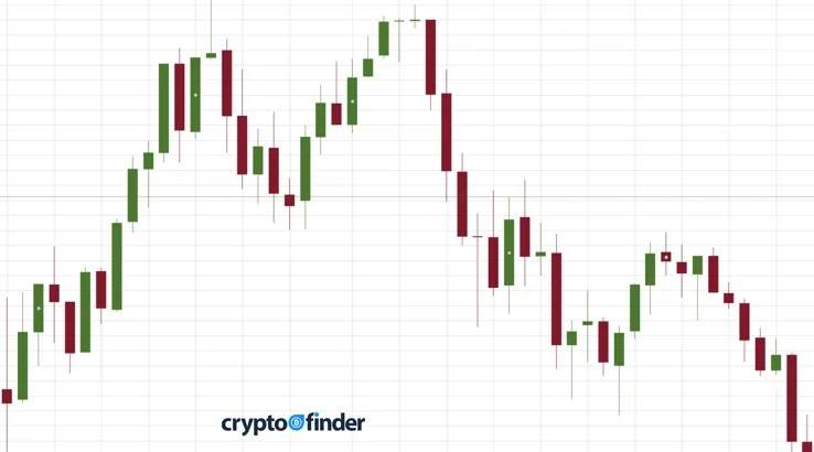
One of the first head scratching moments you are likely to come across when you begin exploring price charts is the candlestick. These are the rectangle shaped objects on a chart coloured either green or red/pink, with lines coming out of the bottom and top. The rectangle shape with the line out of the top resembles a candlestick – hence the name. But what is a candlestick telling you?
The rectangle itself shows the gap between the opening and closing balance for that coin during the period you are searching. So if you are looking at the price of a coin by day, then the coloured rectangular part of each candlestick is showing you the difference between the opening balance for that day’s trading and the closing balance for that day. If the candlestick is green, the bottom of that rectangle shows the opening price, and the top of that rectangle shows the closing price. Green is good because it means that the value of your coin increased during that day.
If the candlestick is reddish in colour, it means the opening price is at the top, and the closing price is at the bottom. This is obviously bad news as it means that the value of your coin went down during the day. However, there is more to the story.
The “wicks” that come out of the rectangle on the top and bottom show the highest and lowest range of prices within that day. For example, during any 24-hour period, a coin may have opened at $1 and closed at $2. However, at some point during the day it may have dipped as low as 50c and risen as high as $3. This is useful information, as it shows how volatile the market is within each 24-hour period, and not just the opening and closing prices.
The more volatile the market, the higher the chance that the gain (or loss) your coin suffered over the course of the day may continue or be corrected on the next trading day. This is because it shows if the market is expanding down more than it is expanding up, or vice versa. It can also show whether the market is consolidating. This information can give you an indication as to whether a coin is likely to crash or moon.
Imagine a scenario where the wick at the top of the candle is very short. This would suggest that the coin is on the up as it has ended the day close to its highest recorded price for the day. If the wick at the top was long, it would show that, at some point during the day, the price of the coin was much higher, but people started to sell it to make a profit. This would suggest the market is about to go down or go bearish.
Conversely, if the wick at the bottom of a candle is short, it suggests that people are still selling the coin. This adds to the supply and suggests the price is likely to go down even further. However, if the wick at the bottom is quite long, then it suggests the price of the coin has already dipped, and people have started buying it again, hoping to get it at its lowest value. This may result in an upward movement on the following day.
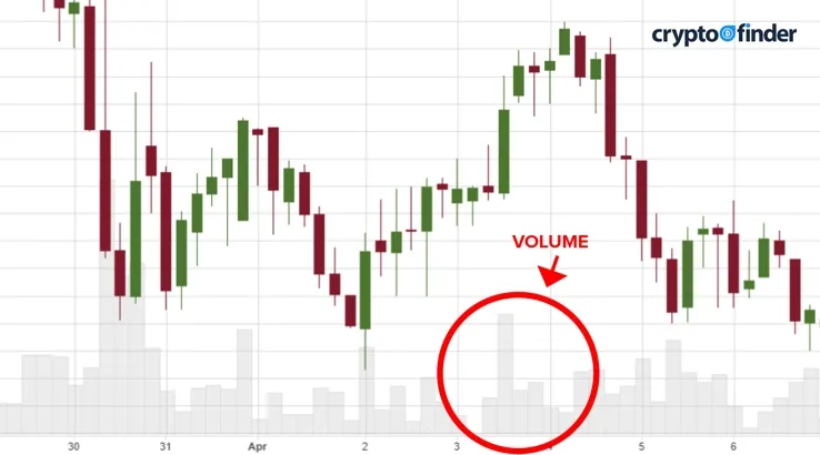
Another metric you will see when looking at price graphs is the volume. There are two types of volume to consider. There is the literal volume of sales, which is how many coins were traded in the period you are looking at (daily, weekly, monthly, etc.), and then there is the dollar volume for that period.
The literal volume, the amount of coins traded, often appears as a column along the bottom of a price chart. The height of this column acts as a visual identifier of the volume, and the colour indicates if that volume tended to be more bearish (sales) or bullish (buys). Volume is important in that it shows just how serious a bullish or bearish market is. The larger the volume of trade, the bigger the volatility we’ll see in the price. Traders like volatility because it provides the opportunity to buy at a low price and sell at a high price.
If we’re looking to predict whether a bullish or bearish trend will continue over an extended period, the volume can act as an indicator. If the volume of trades is high and the price is increasing, then there is some genuine momentum in this price swing. So if you were thinking of selling your coin, you may want to hold off with the expectation that the upward trend will continue and possibly even buy more in anticipation of that rise.
Of course, you should never look at just one indicator. You should look at patterns that align across a number of indicators. So what you may be looking for is not only a large spike in the volume of transactions, but to see it combined with a long wick at the top of the candlestick. This indicates that the bulls are no longer driving the price upwards, and the bears are starting a downward trend. In which case, it could be a good time to sell.
If volume of trades overall is low, then it would suggest that there isn’t much conviction in the market, so that any change we see in price (upwards or downwards) is less likely to continue into the next period.
"Scale into your position slowly as the market reaches the top or bottom of the range. Picking exact tops and bottoms is extremely difficult, and scaling in will help you get a good average entry price. If the range is compromised and volume starts to flow into the market, you should have a stop loss ready to execute or, if time allows, position yourself for a breakout trade. However, be careful not to rush or FOMO into your next position – a well-planned trade is a well-executed trade."
If you notice a sudden, big spike in volume, which may occur around a big announcement, pay special attention. It likely indicates that there is about to be some significant movement in that coin’s price up or down. This can provide the heads-up you need to buy or sell before the larger market gets wind that something is happening.
As for the second type of volume, the dollar volume for a period, that relates to the price of the coin multiplied by the volume traded. This allows us to compare coins of different prices. For example, a spike of a million trades in a coin worth $1 may sound like a lot, but only $1 million dollars’ worth of trading has been done. But a spike of 100,000 trades of a $100 coin is actually far more explosive as this shows $100 million dollars’ worth of trading has been done. The latter coin, while doing less literal volume, is actually more significant of a change if you were deciding between the two.
While looking for volume and candlestick trends over short periods is a vital part of predicting price movements, it’s dangerous to consider just these metrics. You want to also look at the price movements across a larger section of time (days, weeks, months, etc.) to ensure you don’t get tricked by the market into selling or buying at the wrong time. This is where the moving average comes into play.
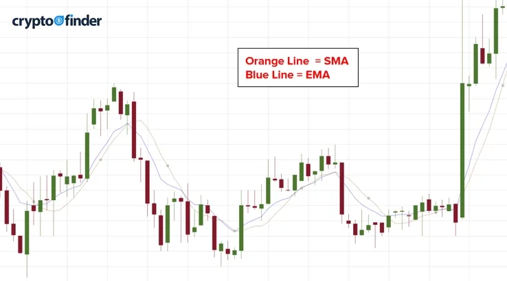
There are two types of moving average you will come across while examining price graphs: the SMA (simple moving average) and the EMA (exponential moving average).
The SMA is, as its name suggests, quite simple. It displays the average closing price over a set period of time. Let’s say you're looking at a seven-day period. The SMA value for any day is that day, plus the previous six days, divided by seven. This line moves up and down across your graph because each day sees a new closing price added and an older closing price dropped. This is why it’s considered a moving average. The SMA helps show a trend over time on a market, taking out all the volatility within a 24-hour period and instead taking a bird’s eye view of the landscape.
The way you would see these lines indicated on a chart are SMA(7) or MA(7). The SMA/MA is self-explanatory while the number in the brackets represents the number of periods the average is taking into account. If you are looking at a daily chart then that is seven days. If it's an hourly chart, it's seven hours.
The EMA is a slightly different beast and more complicated to explain. Using the seven-day example from above, rather than treating the closing balance of each day equally (and just dividing the total sum by seven), the EMA graph weights each day differently based on its proximity to the current day. So the previous day is given more weight than the day before it, with descending importance granted to days as you go back through the seven-day period. The EMA is more reactionary and can adapt quicker to volatility in the market.
So how does a moving average help you read the market? It shows the support or resistance to buying or selling at a certain price point. If the closing price for the day can't get past the moving average it suggests there is resistance at that point where people are selling. If it gets up past the moving average, it lends support to the idea that it is a bullish market and you should look for an opportunity to sell. If the closing price can't dip below the moving average, it suggests there is support in the form of people buying at that price. If it does dip below the moving average, then it suggests that the market is moving into a period of downward trend and that we may start to see some buying.
A rule of thumb when dealing with moving averages is that the longer the period examined, the stronger the indicator. With that in mind, our example of seven days isn’t that strong. Looking at 70 days would provide a more robust indication of whether the market is beginning to move above or below the moving average.
One of the reasons why this form of cryptocurrency technical analysis is quite effective is because traders use them to set buy and sell limits on coins. Buy and sell limits are pre-determined smart contracts set up within an exchange, whereby a trader says they will buy (or sell) a coin when the price hits a certain figure. As it's a smart contract, it will activate automatically, without human intervention, when the correct figure is reached.
For example, imagine that the price of a coin is at $10, and the moving average is $15. A trader may create a smart contract with an exchange that stipulates a purchase of 100 coins when the price hits $15. That's because a movement like this would suggest a bullish market and a likely price increase beyond that. Conversely, if the price of the coin then rose to $20, the moving average would rise with it, perhaps getting to $17. At this point, the trader may set a sell limit of $17, whereby those 100 coins will be sold if the market shows a bearish trend and dips back below the moving average.
In this scenario, the trader has used the moving average as a guide to hopefully make a minimum profit of $2 per coin.
Ultimately what you are trying to do with a moving average is predict where the market has set its buy and sell limits. Experimenting with different moving average periods and comparing them to candlesticks is key here. If you can see that the wicks on candles are extending above or below the moving average (depending on which side of the line the price is at), but the closing balance is not passing the line, you’re seeing an indication of support (above the line) or resistance (below the line) for that price. This is because as soon as the market went past that point, smart contracts were activated, bringing the price back.
This gives you some indication of where the buy and sell limits of the market have been set.
Deciding whether you should use SMAs or EMAs depends on the type of trading you want to do. Generally, SMAs are more useful if you are trading for longer periods of time, say weekly or even daily, as it doesn’t react to volatility and gives a more wide-angled view of the market. For day traders who are looking at hourly (or less) changes, the EMA can more quickly spot price fluctuations and opportunities to make money.
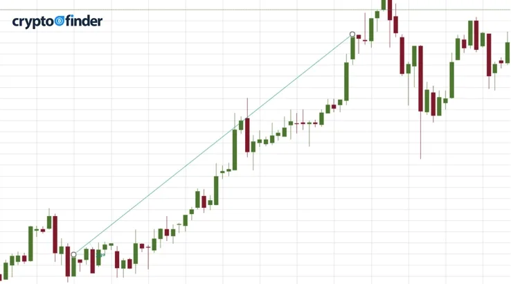
Using the above information as your weapon, you can now begin to look at larger scale trends. This is best defined by the wicks on the end of our candlesticks. When looking at a price graph, you will be able to note the lowest candlestick wick in that period. This shows the lowest point during that period at which the coin was traded. Let’s call that Point A.
Now look at the days since that date. As long as the low point, the bottom of the bottom wick, on a given day is higher than Point A, the market is on an upward trend. You’ll often need to look at months or even years’ worth of data to see if there is an upward trend as the market will naturally consolidate and fluctuate in waves in shorter periods (days or weeks). But in general, if those low wicks continue to be higher than Point A, you’re on an upward trend.
Naturally, the converse situation is a downward trend. If you have, over your long period view, a clear high point, which we’ll call Point B, and the top of the top wick is consistently lower than Point B in the days that follow, you have a downward trend.
Trading with the trend means you are buying on the up and selling on the down. This is the overall goal for those looking towards longer-term gains with their coin purchases.
When you’re looking to establish a trend line on a graph, you will click two points – the point where you are starting your trend (the lowest or highest) and the current day. However, to be sure that a trend is indeed a trend, you want to see at least one of the candlesticks in between these points touch the line. This third touch makes the trend line valid. If you can’t get that, then the period you're looking at isn’t giving you clear evidence of a trend. And if you can get more than three touches, then you’re increasing the validity of that trend.
It’s important to note that trends can be deceptive. Something that looks clearly like a downtrend in a 90-day period may, when you zoom out to a 900-day period, show itself to be a consolidation period in a grander upward trend. So make sure you’re aware when you analyse for trends that if you look at the 90-day trend without looking at the 900-day trend, you could get caught out.
"Once your trade is in profit, consider moving your stop loss to break even or trailing it with the market. Mean reversion trades happen with pace, especially on lower timeframes. If money starts flowing back in and the market shifts against you, it's better to have locked in small profits than see a once profitable trade get stopped out for a loss."
We’ve now taken you through the nuts and bolts of reading the price chart on your favourite exchange or website, but there is plenty more on offer. As you can imagine, there are multiple ways of visualising this data and interpreting the mathematics. These various visualisations are called indicators, and their main motive is to help you arrive at a forecast of what may happen in the future quicker and with more confidence.
Remember, a cryptocurrency technical analysis only describes what has happened in the past to offer a suggestion of what might happen in the future. It does not predict what will happen!
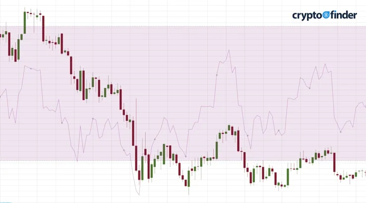
One of the more popular indicators you will come across is the relative strength index, or RSI. The RSI looks at the momentum in a coin’s trading history to try and predict whether it is overbought or oversold. It’s represented by a scale of 0 to 100 (with 100 being the overbought end) and looks back over 14 periods in establishing its number.
Find out all the latest cryptocurrency news
The relative strength index is established by looking at the average gains over a 14-day period, divided by the average losses. It’s a moving indicator, so each new day is a new 14-day period since the oldest day drops out and the most recent day pops in.
A coin becomes overbought if there is an extended period of gains, and it is oversold if there is an extended period of losses. What this tells us is that the market will be ready for a natural correction at the extremes of the RSI. Generally, a coin is considered overbought if the RSI is past 70, and oversold if it is below 30. If, as part of your cryptocurrency technical analysis, you see the RSI is into either of these extremes, it adds to the argument that there is about to be a reversal in the market.
If volumes, candlesticks and moving averages also support this argument, you can more confidently buy or sell.
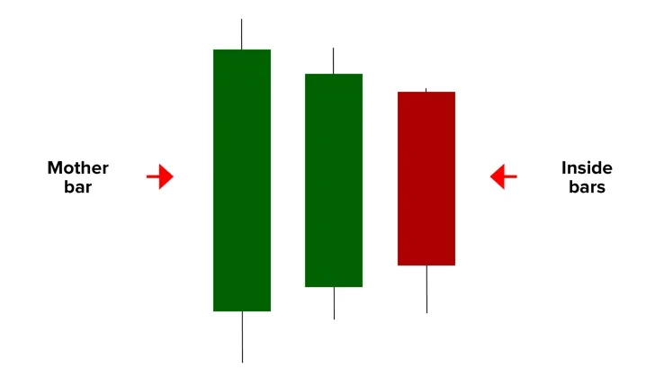
We can also use candlesticks to look for consolidation and tightening of the market. Let’s say we're looking at a daily chart. If a candlestick on one day, including its wicks, is smaller than the day before and fits within its range, it is called an inside bar. It shows that the market is consolidating. So if one day a coin reached a high of $10 and a low of $5, and then the next day it reached a high of $8 and a low of $6, it's an inside bar. (It's inside the $10 to $5 range of its predecessor.)
If the next day you then got a high of $7 and a low of $6.50, you have a second consecutive day of inside bars. This shows that the market is tightening. This is important to note as, historically, a tightening market is an indicator that a breakout is about to occur. A breakout is a spike in trading volume, driving the price quickly and significantly either down or up. It occurs when the market has tightened to a point where traders aren’t making money, so the situation becomes delicately poised. When a move is made either way, it then tends to be big.
If you are looking at the charts and notice a period of tightening or consolidation, then you may be seeing the seeds of a breakout. This could go on for days. But at the point at which the next candlestick exceeds its predecessors' range and is not an inside bar, this is when you can expect a breakout. If the candlestick exceeds the high point of the day before, it will be a bullish breakout; if it dips beyond the low point, it will be a bearish breakout. If this movement is backed up by a large change in trading volume, you have a good indicator that a significant price shift is on.
For the majority of this guide we've explored the price chart since it's the most common way to read the market; however, it's not the only way. More common than a price chart is the price table. It shows a list of all the coins, shows whether they are going up or down, and what the high points and low points are for the day.
More importantly, you may also see what the prices of a coin are on different exchanges. For example, you might see that one exchange could be buying a coin at $2.10, while another is selling the same coin at $1.90.
Simple math should tell you that if you go to the second exchange and buy coins at $1.90, then go to the first exchange and sell them at $2.10, there's a 20 cent profit to be made. This situation, a difference in the price of a cryptocurrency between two exchanges at the same time, is called arbitrage. For the eagle-eyed trader with the capacity to swiftly act with their trades, it can be an opportunity to make some money.
However, there are caveats. There are fees charged by exchanges for making these transactions, plus, the need for a transaction to be confirmed on the blockchain can delay the process long enough for the window of opportunity to close before it's executed. These are just two factors to consider and take into account before you pounce on an arbitrage opportunity.
Learn more about cryptocurrency arbitrage in our handy guide.
30 May 2024 |
24 Apr 2024 |
23 Feb 2022 |
31 Jan 2022 |
3 Nov 2021 |
Images: Shutterstock
We reviewed more than 20 crypto exchanges to find you the ones best suited to day trading cryptocurrency.
Day trading crypto involves making short-term trades to take advantage of small price fluctuations.
Learn how you can use various short-selling strategies to further your Bitcoin profits.
You can trade crypto futures in Australia, but your options may be limited.
Compare a list of gold-backed cryptocurrencies.
Your detailed guide to cryptocurrency trading bots, how they work and the benefits and risks you need to consider when choosing a crypto trading bot.
Learn about OTC cryptocurrency trading, what it is and how it works in this comprehensive guide.
Learn how crypto arb trading works and how to get started with this guide.
Find out what exactly bitcoin futures trading is, where to get started and how to pick the right trading site.